Packaging That Pops: Attracting Customers on the Dispensary Shelf
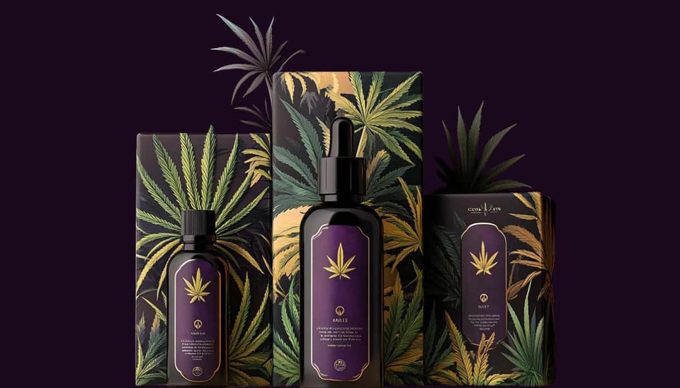
In a crowded dispensary environment, packaging can make or break a product’s success. Beyond mere aesthetics, it must satisfy strict cannabis regulations (child resistance, accurate labeling) while also showcasing brand identity and standing out next to rival offerings. For new and seasoned buyers alike, packaging is often their first introduction to your product, an instant signal of quality, safety, and style.
This article explores best practices in cannabis packaging design. We’ll discuss balancing compliance (like mandated THC warnings) with creativity, highlight sustainable packaging as a selling point, and show how Rival Response can guide design choices by comparing competitor packaging approaches. Whether you’re an edibles startup or a well-known dispensary launching a private label, harnessing these packaging strategies can elevate brand perception, boost shelf appeal, and turn casual browsers into loyal fans.
The Compliance Must-Haves
- Child-Resistant Features
- Many jurisdictions require re-sealable, child-proof containers for flower, edibles, and concentrates. Packaging that’s too easy to open can lead to hefty fines or product recalls.
- Use lockable caps, tamper-evident seals, or push-and-turn mechanisms as mandated.
- Accurate Labeling
- Include THC/CBD percentages, recommended dosage, batch IDs, and disclaimers like “For adults 21+” or “Consume responsibly.”
- List any additional mandatory symbols or warnings (e.g., a universal cannabis symbol in some states).
- Prominent Disclaimers
- Language about psychoactive effects, potential drowsiness, or “keep out of reach of children” must be clearly visible.
Note: These compliance details can impact your design. If your brand’s aesthetic is minimalist, you’ll need strategic placement of disclaimers, so they don’t clutter or overshadow your core branding. Tools like Rival Response help you observe competitor packaging—if they’re ignoring certain disclaimers or crowding the label with unnecessary text, you can take a more balanced, consumer-friendly approach.
Balancing Branding & Compliance
Achieving striking packaging while meeting regulations is an art. Overdo disclaimers, and your box might look clinical; omit them and risk legal trouble.
Design Tips:
- Smart Layout: Reserve specific label areas for THC warnings, usage instructions, or government seals. Surround them with brand colors, logos, or patterns so they don’t feel tacked on.
- Color Theory: Certain states prohibit cartoonish visuals, but you can still use bold palettes that communicate your brand vibe.
- Unified Fonts & Imagery: Keep typography consistent with your overall brand identity (logo, website, etc.) to maintain recognition.
Example: If your competitor uses generic black-and-white packaging with tiny disclaimers, you could stand out by employing modern, premium packaging in neutral tones—and placing disclaimers in a clearly readable but stylish area. Rival Response’s competitor analysis might confirm that your unique aesthetic resonates with a segment bored by dull designs.
Emphasizing Sustainability
Environmental consciousness is rising within cannabis circles. Many consumers appreciate eco-friendly or sustainable packaging:
- Biodegradable Materials: Swap plastic for hemp-based or compostable solutions.
- Minimalism: Reduce excess layers—just enough to protect and comply with child-resistant rules.
- Recyclable Options: If child-proof plastic is mandatory, choose recyclable plastics with clear disposal instructions.
Marketing Bonus: Green packaging differentiates you from less eco-conscious competitors. Rival Response can show if a competitor’s site garners complaints about excessive plastic wrap an opportunity for you to highlight your reduced-waste approach.
However, remain vigilant: compliance sometimes forces thicker, multi-layer packaging. Aim for the best possible compromise. Advertise your sustainable steps—like using soy-based inks or shredded paper from recycled sources—without overstating claims. Honest, transparent labeling about your sustainability efforts can attract an audience that values ethics as well as product quality.
Visual Storytelling & Brand Identity
Color & Illustration
- Colors: Earthy browns and greens evoke a natural vibe, while metallic accents suggest a premium, futuristic feel. Bold pink or orange can stand out if it aligns with your brand persona.
- Illustrations: Hand-drawn sketches or geometric patterns can differentiate you from competitor packages that rely on stock imagery or generic cannabis leaves.
Typography & Messaging
- Readable Fonts: Ensure disclaimers remain legible. A small, elegant typeface is fine for brand slogans, but legal info should be bigger.
- Tone: If you’re a wellness-focused brand, use calm, comforting language. For recreational fun, incorporate playful copy like “Indulge responsibly—21+ only!”
Rival Response Advantage
Analyzing competitor packaging reveals whether they skew minimal, loud, or sterile. If competitor feedback shows consumer complaints about confusing labels, you can emphasize clarity. On the flip side, if they’re overly clinical, your brand might lean more artistic to capture a sense of joy or creativity. The key is authenticity: match packaging design to your dispensary or product’s core values so customers sense a genuine identity, not just a marketing gimmick.
Practical Testing & Iteration
Even the best design might need refinement. Conduct small-scale packaging tests:
- Focus Groups: Gather 10–12 cannabis consumers, let them handle and read your packaging. Track first impressions—did disclaimers stand out, or was the brand name overshadowed?
- In-Store Feedback: Place prototypes on your shelf next to competitor products and ask staff or loyal customers to share opinions.
- Rival Response Check: If competitor data shows a spike in a certain new packaging trend, gauge how you can adapt or better it.
Frequent iteration ensures your packaging remains relevant, user-friendly, and aligned with evolving laws.
Packaging in the cannabis sphere is more than a protective shell: it’s a brand ambassador on the dispensary shelf, a compliance statement, and an eco-conscious representation of your values. By blending mandated labeling and child-resistant features with unique aesthetics, you create a memorable first impression. Highlighting sustainability can further attract conscious consumers, while consistent visual storytelling cements brand recognition.
Harnessing Rival Response competitor insights refines this process—revealing whether rivals skimp on disclaimers or adopt bland designs. This knowledge allows you to forge a distinct path, appealing to customers who seek clarity, ethics, and creativity in their cannabis purchases. Ultimately, well-executed packaging signals credibility and care, easing consumer apprehensions in a highly regulated market, leading them to trust, choose, and champion your brand over the competition.
Tip: Keep packaging updates on a yearly or bi-yearly schedule. Regulations evolve quickly, and subtle redesigns can refresh consumer interest and maintain compliance.